Create an Awesome Responsive Navbar in React JS with Mobile Menu
To create an awesome responsive navbar in React JS with a mobile menu, you’ll want to implement a navigation bar that adapts to different screen sizes, showing a full menu on larger screens and a collapsible or dropdown menu on mobile devices.
Here’s how you can build a responsive navbar:
Steps Overview
- React Setup: Start by creating a React app or integrating the navbar into an existing React project.
- Navbar Structure: Define a structure for the navbar with links for navigation.
- CSS Styling: Use CSS or a library like Tailwind CSS to style the navbar and make it responsive.
- Mobile Menu Toggle: Implement a button (usually a “hamburger” icon) that will open and close the mobile menu.
- Responsive Design: Utilize CSS media queries to ensure the navbar looks good on both desktop and mobile devices.
"use client";
import { useState, useEffect } from "react";
import { AiOutlineClose, AiOutlineMenu } from "react-icons/ai";
import Link from "next/link";
import Image from "next/image";
import { useRouter } from "next/navigation";
const Navbar = () => {
const [sticky, setSticky] = useState(false);
const [mobileMenu, setMobileMenu] = useState(false);
const router = useRouter();
useEffect(() => {
const handleScroll = () => {
const currentScrollPos = window.scrollY;
setSticky(currentScrollPos > 0);
if (mobileMenu) {
setMobileMenu(false);
}
};
window.addEventListener("scroll", handleScroll);
return () => window.removeEventListener("scroll", handleScroll);
}, [mobileMenu]);
const toggleMenu = () => setMobileMenu(!mobileMenu);
const closeMobileMenu = () => setMobileMenu(false);
const isHomePage = router.pathname === "/";
const menuIcon = mobileMenu ? <AiOutlineClose /> : <AiOutlineMenu />;
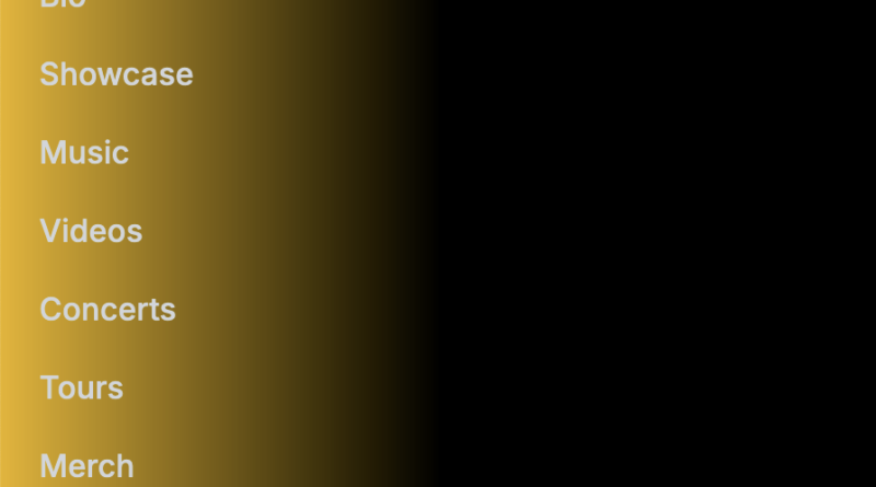
const menuItems = [
{ path: "/bio", text: "Bio" },
{ path: "/showcase", text: "Showcase" },
{ path: "/music", text: "Music" },
{ path: "/videos", text: "Videos" },
{ path: "/concerts", text: "Concerts" },
{ path: "/tours", text: "Tours" },
{ path: "/merch", text: "Merch" },
{ path: "/contact", text: "Contact" },
];
return (
<nav
className={`bg-gradient-to-r from-yellow-500 via-black to-black ${
sticky ? "fixed top-0 z-50 w-full" : ""
}`}
>
<div className="mx-auto max-w-7xl px-4 sm:px-6 lg:px-8">
<div className="flex items-center justify-between h-16">
<div className="flex items-center">
<Link href="/">
<div className="flex items-center hover:opacity-80">
<div>
<Image
src="/logo.png"
alt="Yo Yo Honey Singh"
width={50}
height={50}
className="rounded-full bg-gray-300"
/>
</div>
<div>
<p className="font-semibold text-sm md:text-lg lg:text-1xl text-yellow-400 rounded-full leading-tight">
Yo Yo Honey Singh
</p>
<div className="relative w-full flex justify-center items-center">
<hr className="border-yellow-300 border-1.5 shadow-lg rounded-full w-full" />
</div>
<p className="text-xs text-gray-100 rounded-full text-center leading-tight">
The King of Desi Hip-Hop
</p>
</div>
</div>
</Link>
</div>
<div className="hidden lg:block lg:ml-6">
<ul className="flex space-x-4 items-center">
{menuItems.map((item, index) => (
<li key={index}>
<Link
href={item.path}
className="text-gray-300 hover:bg-yellow-500 hover:text-white rounded-md px-3 py-2 text-sm font-medium"
>
{item.text}
</Link>
</li>
))}
<li>
<Link
href="/exclusive-deals"
className="relative p-0.5 inline-flex items-center justify-center font-bold overflow-hidden group rounded-md"
>
<span className="w-full h-full bg-gradient-to-br from-yellow-400 via-yellow-600 to-yellow-700 group-hover:from-yellow-500 group-hover:via-yellow-700 group-hover:to-yellow-600 absolute"></span>
<span className="relative px-2 py-1 transition-all ease-out bg-black rounded-md group-hover:bg-opacity-0 duration-400">
<span className="relative text-white text-sm font-medium">
Exclusive Deals
</span>
</span>
</Link>
</li>
</ul>
</div>
<div className="-mr-2 flex lg:hidden">
<button
onClick={toggleMenu}
className="inline-flex items-center justify-center p-2 text-gray-400 hover:bg-yellow-500 hover:text-white rounded-md focus:outline-none focus:ring-2 focus:ring-inset focus:ring-white"
aria-expanded={mobileMenu}
>
<span className="sr-only">Open main menu</span>
{menuIcon}
</button>
</div>
</div>
</div>
<div
className={`lg:hidden ${mobileMenu ? "block" : "hidden"}`}
id="mobile-menu"
>
<div className="px-2 pt-2 pb-3 space-y-1">
<ul>
{menuItems.map((item, index) => (
<li key={index}>
<Link
href={item.path}
className="text-gray-300 hover:bg-yellow-500 hover:text-white block px-3 py-2 rounded-md text-base font-medium"
onClick={closeMobileMenu}
>
{item.text}
</Link>
</li>
))}
<li>
<Link
href="/exclusive-deals"
className="relative p-0.5 inline-flex items-center justify-center font-bold overflow-hidden group rounded-md mt-2 ml-2"
onClick={closeMobileMenu}
>
<span className="w-full h-full bg-gradient-to-br from-yellow-400 via-yellow-600 to-yellow-700 group-hover:from-yellow-500 group-hover:via-yellow-700 group-hover:to-yellow-600 absolute"></span>
<span className="relative px-2 py-1 transition-all ease-out bg-black rounded-md group-hover:bg-opacity-0 duration-400">
<span className="relative text-white text-sm font-medium">
Exclusive Deals
</span>
</span>
</Link>
</li>
</ul>
</div>
</div>
</nav>
);
};
export default Navbar;
On Desktop View
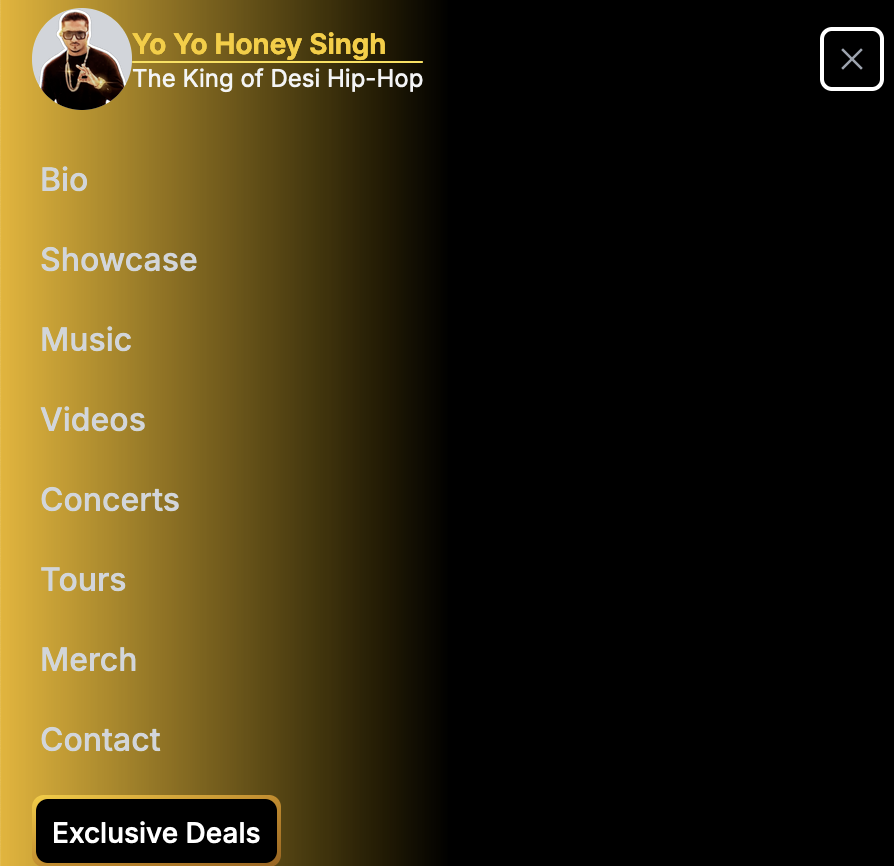
On Mobile View